Introduction to Plotly
Introduction
This notebook and accompanying webinar was developed and released by the enDAQ team. This is the third “chapter” of our series on Python for Mechanical Engineers: 1. Get Started with Python * Blog: Get Started with Python: Why and How Mechanical Engineers Should Make the Switch 2. Introduction to Numpy & Pandas for Data Analysis 3. Introduction to Plotly for Plotting Data * Watch Recording of This 4. Introduction of the enDAQ Library
To sign up for future webinars and watch previous ones, visit our webinars page.
Recap of Python Introduction
Python is popular for good reason
There are many ways to interact with Python
Here we are in Google Colab based on Jupyter Notebooks
There are many open source libraries to use
Today we are covering Plotly for plotting
Why Do We Plot?
To Understand Relationships, Make an Observation
Interactivity Matters!
To Share & Present
Beautiful Matters!
Overview of Python Plotting Libraries
Like everything in Python, there are a few options for plotting data! We’ll focus on Plotly but quickly cover: - Matplotlib - Seaborn - ggplot - bokeh - Plotly
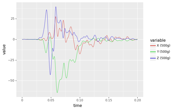
Data Source
For some shock data, we’ll use the motorcycle crash test data discussed in our blog post on pseudo velocity. This was filtered with a 150 low pass filter first to clean the signal using the endaq library (which uses SciPy under the hood).
[ ]:
import pandas as pd
df = pd.read_csv('https://info.endaq.com/hubfs/data/motorcycle-crash.csv',index_col=0)
[ ]:
df
| X (500g) | Y (500g) | Z (500g) | |
|---|---|---|---|
| timestamp | |||
| 0.00000 | -0.055582 | 0.033337 | 0.032217 |
| 0.00010 | -0.056731 | 0.041513 | 0.032720 |
| 0.00020 | -0.056972 | 0.049888 | 0.033106 |
| 0.00030 | -0.056273 | 0.058399 | 0.033419 |
| 0.00040 | -0.054605 | 0.066982 | 0.033706 |
| ... | ... | ... | ... |
| 0.19952 | 0.383610 | 0.117662 | -0.292337 |
| 0.19962 | 0.411270 | 0.135782 | -0.275515 |
| 0.19972 | 0.438324 | 0.153832 | -0.258591 |
| 0.19982 | 0.464640 | 0.171657 | -0.241783 |
| 0.19992 | 0.490098 | 0.189112 | -0.225302 |
2000 rows × 3 columns
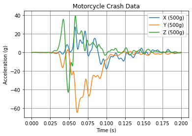
Matplotlib
The most popular plotting library and the default go-to. But… there is a new game in town!
[ ]:
import matplotlib.pyplot as plt
plt.plot(df)
plt.title('Motorcycle Crash Data')
plt.ylabel('Acceleration (g)')
plt.xlabel('Time (s)')
plt.legend(df.columns)
plt.grid(color='grey')
plt.show()
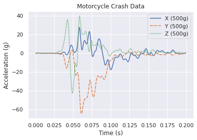
Seaborn
A wrapper around Matplotlib to simplify the interface, beautify the plots, and support more stats-based analysis. Here is their documentation specifically on aesthetics, they care too!
[ ]:
import seaborn as sns
sns.set_theme()
p = sns.lineplot(data=df)
p.set_title('Motorcycle Crash Data')
p.set_ylabel('Acceleration (g)')
p.set_xlabel('Time (s)')
Text(0.5, 0, 'Time (s)')
ggplot
Introduces a “grammer of graphics” logic to plotting data which allows explicit mapping of data to the visual representation. This is something plotly express excels at.
[ ]:
from plotnine import ggplot, aes, geom_line
df_ggplot = df.copy()
df_ggplot['time'] = df.index
df_ggplot = pd.melt(df_ggplot, id_vars='time')
df_ggplot
(
ggplot(df_ggplot) # What data to use
+ aes(x="time", y='value',color='variable') # What variable to use
+ geom_line() # Geometric object to use for drawing
)
/usr/local/lib/python3.7/dist-packages/plotnine/utils.py:1246: FutureWarning: is_categorical is deprecated and will be removed in a future version. Use is_categorical_dtype instead
if pdtypes.is_categorical(arr):
<ggplot: (8785480354521)>
Bokeh
Finally, we have interactivity!
[ ]:
from bokeh.plotting import figure, show
from bokeh.io import output_notebook
output_notebook()
p = figure(title='Motorcycle Crash Data',
x_axis_label='Time (s)',
y_axis_label='Acceleration (g)')
colors = ['red','green','blue']
for c,color in zip(df.columns,colors):
p.line(df.index, df[c], legend_label = c, line_color = color, line_width = 2)
show(p)
Plotly
Interactive, beautiful, easy!
[ ]:
!pip install -U -q plotly
|████████████████████████████████| 23.9 MB 1.5 MB/s
[ ]:
import plotly.express as px
import plotly.io as pio; pio.renderers.default = "iframe"
fig = px.line(df)
fig.update_layout(
title_text = 'Motorcycle Crash Data',
xaxis_title_text = "Time (s)",
yaxis_title_text = "Acceleration (g)")
fig.show()
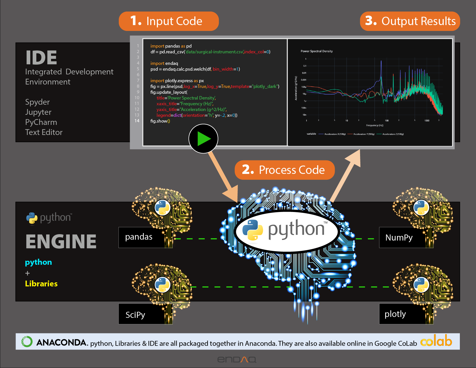
How Does Plotly Work?
There are three main components to how/why Plotly works: 1. Python Library 2. Figure Objects 3. JavaScript Library
To illustrate this relationship, let’s make a Plotly Treemap!
[ ]:
df_tree = pd.DataFrame({
'names': ["Plotly","Python", "Figure Object", "JavaScript", "Express", "Graph Objects","Data","Layout",'Frames',"Plotly.js"],
'parents' : ["", "Plotly", "Plotly", "Plotly", "Python",'Express',"Figure Object","Figure Object","Figure Object","JavaScript"]
})
[ ]:
fig = px.treemap(
names = df_tree.names,
parents = df_tree.parents
)
fig.update_traces(root_color="lightgrey")
fig.update_layout(
font_family='Open Sans',
font_size=32)
fig.show()
Plotly Express was introduced in May 2019 and is a GAME CHANGER! Here is the introduction article. 
Shoutout to Plotly’s Docs
Before we proceed, I want to really stress how good the docs are from Plotly. They have a TON of examples, and very good documentation. We’ll be focusing on Plotly Express.
They also have their own community forum that is pretty rich with examples and people helping each other out.
Styling Figures
Example Data
Here, to mix it up, we’ll calculate a shock response spectrum from the acceleration data to then be plotting on a log log scale to help show how to style that.
[ ]:
!pip install -q endaq
import endaq
import numpy as np
[ ]:
def get_log_freqs(df,init_freq=1,bins_per_octave=12):
"""Given a timebased dataframe, return a log spaced frequency array up to the Nyquist frequency"""
fs = (df.shape[0]-1)/(df.index[-1]-df.index[0])
return 2 ** np.arange(np.log2(init_freq),
np.log2(fs/2),
1/bins_per_octave)
[ ]:
df_pvss = endaq.calc.shock.pseudo_velocity(df,
get_log_freqs(df,init_freq=1,bins_per_octave=12),
damp=0.05, two_sided=False)
df_pvss = df_pvss*9.81*39.37 #convert to in/s
[ ]:
df_pvss
| X (500g) | Y (500g) | Z (500g) | |
|---|---|---|---|
| frequency (Hz) | |||
| 1.000000 | 47.804683 | 473.402407 | 148.658683 |
| 1.059463 | 49.240508 | 493.307994 | 154.812945 |
| 1.122462 | 50.532563 | 513.039780 | 160.893921 |
| 1.189207 | 51.637517 | 532.374454 | 166.829370 |
| 1.259921 | 52.551121 | 551.046158 | 172.533775 |
| ... | ... | ... | ... |
| 3866.109185 | 0.437852 | 1.025865 | 0.681822 |
| 4096.000000 | 0.413256 | 0.968276 | 0.643536 |
| 4339.560834 | 0.390047 | 0.913923 | 0.607404 |
| 4597.604550 | 0.368145 | 0.862623 | 0.573305 |
| 4870.992343 | 0.347478 | 0.814205 | 0.541124 |
148 rows × 3 columns
Manually Defining the Theme
First let’s start by plotting with the standard theme, modifying only the titles. We’ll also define the scale on the x and y axis to be a log scale.
[ ]:
fig = px.line(df_pvss)
fig.update_layout(
title_text = 'Motorcycle Crash Data',
xaxis_title_text = "Natural Frequency (Hz)",
yaxis_title_text = "Pseudo Velocity (in/s)",
xaxis_type = "log",
yaxis_type = "log")
fig.show()
Now let’s get crazy and customize all the “common” settings. But note that there are a LOT of different parameters that can be explicitely defined. Remember, Plotly has very thorough documentation, so check it out! * Figure Layout * X Axis * Y Axis
You will need to download Open Sans if you like the font like me too! To pick colors, I suggest Color Hex.
[ ]:
fig = px.line(df_pvss)
fig.update_layout(
font_family='Open Sans',
font_size=16,
font_color='#404041',
title_text = 'Motorcycle Crash Data',
title_font_family = 'Showcard Gothic',
title_font_size = 32,
title_font_color = '#e77025',
title_x = 0.5,
xaxis_title_text = "Natural Frequency (Hz)",
xaxis_title_font_family = 'Algerian',
xaxis_title_font_size = 24,
xaxis_title_font_color = '#7f3f98',
xaxis_type = 'log',
yaxis_title_text ="Pseudo Velocity (in/s)",
yaxis_title_font_family = 'Playbill',
yaxis_title_font_size = 24,
yaxis_title_font_color = '#be1e2d',
yaxis_type = 'log',
legend_bgcolor = 'yellow',
legend_title_text = 'Legend',
legend_title_font_size = 24,
legend_orientation = 'v',
legend_y = 1.0,
legend_yanchor = 'top',
legend_x = 1.0,
legend_xanchor = 'right',
plot_bgcolor = '#f3f3f3',
width = 800,
height = 600)
fig.show()
One thing that Plotly does which is REALLY cool is that they use “magic underscore notation” which means that this: ~~~ yaxis_title_font_family = ‘Open Sans ExtraBold’ ~~~
is the equivalent of: ~~~ {‘yaxis’: {‘title’: {‘font’: {‘family’: ‘Open Sans ExtraBold’} } } } ~~~
Now I am particular about my plots and how they look, I think aesthetics matter! So I can create a few custom themes that can be added to figures when making them.
[ ]:
template_light = dict(
template="presentation",
font_family='Open Sans',
font_size=16,
font_color='#404041',
title_font_family = 'Open Sans ExtraBold',
title_font_size = 24,
title_x = 0.5,
xaxis_title_font_family = 'Open Sans ExtraBold',
xaxis_title_font_size = 20,
yaxis_title_font_family = 'Open Sans ExtraBold',
yaxis_title_font_size = 20,
legend_title='',
legend_orientation='h',
legend_y = -0.2,
plot_bgcolor = '#f3f3f3',
yaxis_gridcolor = '#dad9d8',
yaxis_linecolor = '#404041',
yaxis_mirror = True,
xaxis_gridcolor = '#dad9d8',
xaxis_linecolor = '#404041',
xaxis_mirror = True,
)
template_dark = template_light.copy()
template_dark['template'] = "plotly_dark"
template_dark['font_color'] = '#f3f3f3'
template_dark['plot_bgcolor'] = "#111111"
template_dark['yaxis_linecolor'] = "#404041"
template_dark['xaxis_linecolor'] = "#404041"
template_dark['yaxis_gridcolor'] = "#404041"
template_dark['xaxis_gridcolor'] = "#404041"
I also tend to make a lot of similar plots, so it can be helpful to define some axes labels and types as variables.
[ ]:
template_pvss = dict(
xaxis_title_text = "Natural Frequency (Hz)",
xaxis_type = 'log',
yaxis_title_text ="Pseudo Velocity (in/s)",
yaxis_type = 'log'
)
template_psd = dict(
xaxis_title_text = "Frequency (Hz)",
xaxis_type = 'log',
yaxis_title_text ="Acceleration (g^2/Hz)",
yaxis_type = 'log'
)
template_accel = dict(
xaxis_title_text = "Time (s)",
yaxis_title_text ="Acceleration (g)",
)
[ ]:
fig = px.line(df_pvss)
fig.update_layout(
{**template_light, **template_pvss},
title_text = 'Custom Light Theme')
fig.show()
[ ]:
fig = px.line(df_pvss)
fig.update_layout(
{**template_dark, **template_pvss},
title_text = 'Custom Dark Theme')
fig.show()
Themes
As you may have noticed, I used some templates in my custom theme. There are a few to pick from and you can make your own as well. This is well documented with examples on Plotly’s website.
[ ]:
themes = ["plotly", "plotly_white", "plotly_dark", "ggplot2", "seaborn", "simple_white", 'presentation', "none"]
for theme in themes:
fig = px.line(df_pvss)
fig.update_layout(
template_pvss,
template = theme,
title_text = theme,
)
fig.show()
Colors
Plotly also supports a whole range of different color schemes you can implement. There are a lot of built in ones and remember, great documentation!
[ ]:
px.colors.qualitative.swatches().show()
[ ]:
px.colors.qualitative.Alphabet
['#AA0DFE',
'#3283FE',
'#85660D',
'#782AB6',
'#565656',
'#1C8356',
'#16FF32',
'#F7E1A0',
'#E2E2E2',
'#1CBE4F',
'#C4451C',
'#DEA0FD',
'#FE00FA',
'#325A9B',
'#FEAF16',
'#F8A19F',
'#90AD1C',
'#F6222E',
'#1CFFCE',
'#2ED9FF',
'#B10DA1',
'#C075A6',
'#FC1CBF',
'#B00068',
'#FBE426',
'#FA0087']
[ ]:
px.colors.sequential.swatches_continuous().show()
[ ]:
px.colors.sequential.Blackbody
['rgb(0,0,0)',
'rgb(230,0,0)',
'rgb(230,210,0)',
'rgb(255,255,255)',
'rgb(160,200,255)']
Here I’m going to make my own swatch of some kind with a custom color scale.
[ ]:
colors = ['#EE7F27', '#6914F0', '#2DB473', '#D72D2D', '#3764FF', '#FAC85F','#27eec0','#b42d4d','#82d72d','#e35ffa']
fig = px.bar(x=np.arange(10),
y=np.zeros(10)+1,
color=colors,
color_discrete_sequence=colors,
height=200)
fig.update_layout(template_dark,
font_color="#111111",
legend_font_color="white")
fig.show()
When creating a figure you can specify the color sequence you’d like as a parameter. You can use a custom list like what I’m showing here or you can call one of the px.colors.qualitative. lists.
[ ]:
fig = px.line(df_pvss,
color_discrete_sequence=colors)
fig.update_layout(
{**template_dark, **template_pvss},
title_text = 'Custom Colors & Dashes')
fig.show()
Saving Figures
To save static images, first you need to install kaleido.
[ ]:
!pip install -U kaleido
Collecting kaleido
Downloading kaleido-0.2.1-py2.py3-none-manylinux1_x86_64.whl (79.9 MB)
|████████████████████████████████| 79.9 MB 85 kB/s
Installing collected packages: kaleido
Successfully installed kaleido-0.2.1
In colab only you’ll also need to do this install.
[ ]:
!wget https://github.com/plotly/orca/releases/download/v1.2.1/orca-1.2.1-x86_64.AppImage -O /usr/local/bin/orca
!chmod +x /usr/local/bin/orca
!apt-get install xvfb libgtk2.0-0 libgconf-2-4
Now saving an image is easy and they support a few types. More information and options available in their docs.
[ ]:
fig.write_image("fig.png")
fig.write_image("fig.jpeg")
fig.write_image("fig.svg")
fig.write_image("fig.pdf")
You can also keep the interactivity by downloading an HTML file, either with or without the plotly javascript library. You’ll need the library if you want to view the plots when you don’t have internet access. For more, see their docs on saving HTML files.
[ ]:
fig.write_html('fig-full.html')
fig.write_html('fig-small.html',full_html=False,include_plotlyjs='cdn')
Plot Types
Remember Plotly has GREAT documentation, and LOTS of plot types. Below is a GIF of their main page on all the different plot types.
Now here are the gallery of plots all in plotly.express meaning they are super easy to create! Again, check out the docs.
Now we’ll go through a few relevant examples for mechanical engineers and vibration analysis.
Bubble
[ ]:
df_table = pd.read_csv('https://info.endaq.com/hubfs/data/endaq-cloud-table.csv')
df_table = df_table[['serial_number_id', 'file_name', 'file_size', 'recording_length', 'recording_ts',
'accelerationPeakFull', 'psuedoVelocityPeakFull', 'accelerationRMSFull',
'velocityRMSFull', 'displacementRMSFull', 'pressureMeanFull', 'temperatureMeanFull']].copy()
df_table['recording_ts'] = pd.to_datetime(df_table['recording_ts'], unit='s')
df_table = df_table.sort_values(by=['recording_ts'], ascending=False)
df_table
| serial_number_id | file_name | file_size | recording_length | recording_ts | accelerationPeakFull | psuedoVelocityPeakFull | accelerationRMSFull | velocityRMSFull | displacementRMSFull | pressureMeanFull | temperatureMeanFull | |
|---|---|---|---|---|---|---|---|---|---|---|---|---|
| 11 | 11456 | 50_Joules_900_lbs-1629315312.ide | 1597750 | 20.201752 | 2021-07-26 19:56:39 | 231.212 | 2907.650 | 2.423 | 54.507 | 1.066 | 98.745 | 24.175 |
| 10 | 11456 | 100_Joules_900_lbs-1629315313.ide | 1596714 | 20.200623 | 2021-07-26 19:21:55 | 218.634 | 2961.256 | 2.877 | 53.875 | 1.053 | 98.751 | 24.180 |
| 22 | 9695 | Tilt_000000-1625156721.IDE | 719403 | 23.355163 | 2021-07-01 16:21:01 | 0.378 | 330.946 | 0.044 | 11.042 | 0.345 | 99.510 | 26.410 |
| 7 | 11162 | Calibration-Shake-1632515140.IDE | 2218130 | 27.882690 | 2021-05-17 19:16:10 | 8.783 | 1142.282 | 2.712 | 46.346 | 0.617 | 102.251 | 24.545 |
| 17 | 11071 | surgical-instrument-1625829182.ide | 541994 | 6.951172 | 2021-04-22 16:53:10 | 5.739 | 387.312 | 1.568 | 24.418 | 0.242 | 99.879 | 21.889 |
| 8 | 10916 | FUSE_HSTAB_000005-1632515139.ide | 537562 | 18.491791 | 2021-04-22 16:13:24 | 0.202 | 53.375 | 0.011 | 1.504 | 0.036 | 90.706 | 18.874 |
| 2 | 10118 | Bolted-1632515144.ide | 6149229 | 29.396118 | 2021-04-21 21:44:07 | 15.343 | 148.276 | 2.398 | 14.101 | 0.154 | 99.652 | 23.172 |
| 20 | 9680 | LOC__6__DAQ41551_25_01-1625170793.IDE | 8664238 | 63.878937 | 2021-03-25 04:53:27 | 564.966 | 2357.599 | 54.408 | 145.223 | 3.088 | 102.875 | 26.031 |
| 19 | 9680 | LOC__4__DAQ41551_15_05-1625170794.IDE | 6927958 | 64.486054 | 2021-03-25 04:22:10 | 585.863 | 2153.020 | 46.528 | 148.591 | 2.615 | 105.750 | 32.202 |
| 18 | 9680 | LOC__3__DAQ41551_11_01_02-1625170795.IDE | 2343292 | 28.456818 | 2021-03-25 04:06:19 | 622.040 | 8907.949 | 94.197 | 372.049 | 9.580 | 105.682 | 33.452 |
| 21 | 9680 | LOC__2__DAQ38060_06_03_05-1625170793.IDE | 1519172 | 27.057647 | 2021-03-25 02:54:22 | 995.670 | 5845.241 | 131.087 | 323.287 | 3.144 | 104.473 | 25.616 |
| 12 | 11046 | Drive-Home_07-1626805222.ide | 36225758 | 634.732056 | 2021-03-19 19:35:57 | 23.805 | 356.128 | 0.097 | 6.117 | 0.135 | 101.988 | 28.832 |
| 5 | 11046 | Drive-Home_01-1632515142.ide | 3632799 | 61.755371 | 2021-03-19 18:35:55 | 0.479 | 40.197 | 0.021 | 1.081 | 0.023 | 100.284 | 29.061 |
| 14 | 10030 | 200922_Moto_Max_Run5_Control_Larry-1626297441.ide | 4780893 | 99.325134 | 2020-09-22 23:47:35 | 29.864 | 1280.349 | 3.528 | 55.569 | 1.060 | NaN | NaN |
| 0 | 9695 | train-passing-1632515146.ide | 10492602 | 73.612335 | 2020-04-29 18:20:36 | 7.513 | 419.944 | 0.372 | 6.969 | 0.061 | 104.620 | 23.432 |
| 15 | 9695 | ford_f150-1626296561.ide | 96097059 | 1207.678344 | 2020-03-13 23:35:08 | NaN | NaN | NaN | NaN | NaN | NaN | NaN |
| 4 | 9295 | Seat-Base_21-1632515142.ide | 5248836 | 83.092255 | 2019-12-08 10:16:50 | 1.085 | 251.009 | 0.130 | 7.318 | 0.190 | 98.930 | 17.820 |
| 1 | 9316 | Seat-Top_09-1632515145.ide | 10491986 | 172.704559 | 2019-12-08 10:14:31 | 1.105 | 86.595 | 0.082 | 1.535 | 0.040 | 98.733 | 20.133 |
| 16 | 7530 | Motorcycle-Car-Crash-1626277852.ide | 10489262 | 151.069336 | 2019-07-03 17:02:52 | 480.737 | 12831.590 | 1.732 | 143.437 | 3.988 | 100.363 | 26.989 |
| 6 | 0 | HiTest-Shock-1632515141.ide | 2655894 | 20.331848 | 2018-12-04 15:22:54 | 619.178 | 6058.093 | 11.645 | 167.835 | 4.055 | 101.126 | 9.538 |
| 13 | 5120 | Mining-SSX28803_06-1626457584.IDE | 402920686 | 3238.119202 | 2018-09-14 19:28:24 | NaN | NaN | NaN | NaN | NaN | NaN | NaN |
| 9 | 9874 | Coffee_002-1631722736.IDE | 60959516 | 769.299896 | 2000-03-03 20:02:24 | 2.698 | 1338.396 | 0.059 | 5.606 | 0.104 | 100.339 | 24.540 |
| 3 | 10309 | RMI-2000-1632515143.ide | 5909632 | 60.250855 | 1970-01-01 00:00:24 | 0.332 | 17.287 | 0.079 | 1.247 | 0.005 | 100.467 | 21.806 |
[ ]:
fig = px.scatter(df_table,
x="recording_ts",
y="accelerationRMSFull",
size="recording_length",
color="serial_number_id",
hover_name="file_name",
log_y=True,
size_max=60)
fig.update_layout(
template_dark,
title_text ='Scatter Plot with Numeric "Color"',
xaxis_title_text ="Date of Recording",
yaxis_title_text ="Acceleration RMS (g)"
)
fig.show()
[ ]:
df_table['device'] = df_table["serial_number_id"].astype(str)
fig = px.scatter(df_table,
x="accelerationPeakFull",
y="velocityRMSFull",
size="recording_length",
color="device",
color_discrete_sequence=px.colors.qualitative.Light24, #I'll want to use a list with as many discrete values as I can
hover_name="file_name",
log_y=True,
log_x=True,
size_max=60)
fig.update_layout(
template_dark,
title_text ='Scatter Plot with Text "Color"',
xaxis_title_text ="Acceleration RMS (g)",
yaxis_title_text ="Velocity RMS (mm/s)"
)
fig.show()
Drop Downs to Define X & Y Axis Columns
This function (thanks Sam!) highlights another layer of interactivity in Plotly.
[ ]:
def get_correlation_figure_please(merged_df):
cols = [col for col, t in zip(merged_df.columns, merged_df.dtypes) if t != object]
start_dropdown_indices = [0, 0]
# Create the scatter plot of the initially selected variables
fig = px.scatter(
merged_df,
x=cols[start_dropdown_indices[0]],
y=cols[start_dropdown_indices[1]]
)
# Create the drop-down menus which will be used to choose the desired file characteristics for comparison
drop_downs = []
for axis in ['x', 'y']:
drop_downs.append([
dict(
method = 'update',
args = [
{axis : [merged_df[cols[k]]]},
{'%saxis.title.text'%axis: cols[k]},
# {'color':[merged_df['serial_number_id']],'color_discrete_map':SERIALS_TO_INDEX},
],
label = cols[k]) for k in range(len(cols))
])
# Sets up various apsects of the Plotly figure that is currently being produced. This ranges from
# aethetic things, to setting the dropdown menues as part of the figure
fig.update_layout(
title_x=0.4,
updatemenus=[{
'active': start_j,
'buttons': drop_down,
'x': 1.125,
'y': y_height,
'xanchor': 'left',
'yanchor': 'top',
} for drop_down, start_j, y_height in zip(drop_downs, start_dropdown_indices, [1, .85])])
return fig
[ ]:
fig = get_correlation_figure_please(df_table)
fig.update_layout(
template_light,
title_text='Selectable Drop Downs',
)
fig.show()
Map
[ ]:
map_data = pd.read_csv('https://info.endaq.com/hubfs/data/mide-map-gps-data.csv')
map_data
| timestamp | Latitude | Longitude | Date | Ground Speed | |
|---|---|---|---|---|---|
| 0 | 4436.395385 | 42.369258 | -71.019592 | 1.619789e+09 | 1.014 |
| 1 | 4437.395355 | 42.369257 | -71.019600 | 1.619789e+09 | 0.511 |
| 2 | 4438.395324 | 42.369257 | -71.019603 | 1.619789e+09 | 0.184 |
| 3 | 4439.395294 | 42.369256 | -71.019608 | 1.619789e+09 | 0.413 |
| 4 | 4440.395263 | 42.369259 | -71.019605 | 1.619789e+09 | 0.341 |
| ... | ... | ... | ... | ... | ... |
| 1905 | 6343.337073 | 42.496331 | -71.139950 | 1.619791e+09 | 0.170 |
| 1906 | 6344.337041 | 42.496331 | -71.139949 | 1.619791e+09 | 0.025 |
| 1907 | 6345.337008 | 42.496330 | -71.139949 | 1.619791e+09 | 0.166 |
| 1908 | 6346.336976 | 42.496329 | -71.139950 | 1.619791e+09 | 0.117 |
| 1909 | 6347.336944 | 42.496330 | -71.139952 | 1.619791e+09 | 0.100 |
1910 rows × 5 columns
You need a mapbox token here, which is free up to 50,000 “loads” per month.
[ ]:
import os
from dotenv import load_dotenv
load_dotenv()
MAPBOX_ACCESS_TOKEN = os.getenv('MAPBOX_ACCESS_TOKEN')
[ ]:
px.set_mapbox_access_token(MAPBOX_ACCESS_TOKEN)
fig = px.scatter_mapbox(map_data,
lat="Latitude",
lon="Longitude",
color="Ground Speed",
zoom=10)
fig.update_layout(
template_dark,
title_text ='Mide to Airport Drive',
coloraxis_showscale=False)
fig.show()
3D Line
[ ]:
df_rolling_psd = pd.read_csv('https://info.endaq.com/hubfs/data/rolling-psd.csv',index_col=0)
df_rolling_psd
| frequency (Hz) | X (40g) | Y (40g) | Z (40g) | Resultant | Time | |
|---|---|---|---|---|---|---|
| 0 | 1.000000 | 1.021500e-04 | 1.632998e-04 | 6.043786e-05 | 3.258877e-04 | 65.0 |
| 1 | 1.259921 | 1.267597e-04 | 1.210042e-04 | 7.970037e-05 | 3.274643e-04 | 65.0 |
| 2 | 1.587401 | 1.159243e-04 | 1.182557e-04 | 6.159546e-05 | 2.957754e-04 | 65.0 |
| 3 | 2.000000 | 2.432255e-04 | 9.195336e-05 | 8.133421e-05 | 4.165131e-04 | 65.0 |
| 4 | 2.519842 | 1.447308e-04 | 2.526833e-05 | 5.100299e-05 | 2.210021e-04 | 65.0 |
| ... | ... | ... | ... | ... | ... | ... |
| 20 | 101.593667 | 3.904692e-07 | 7.823465e-07 | 4.461462e-06 | 5.634277e-06 | 6285.0 |
| 21 | 128.000000 | 1.520778e-07 | 5.739868e-08 | 5.433635e-07 | 7.528400e-07 | 6285.0 |
| 22 | 161.269894 | 6.667854e-08 | 2.399063e-08 | 4.284568e-08 | 1.335149e-07 | 6285.0 |
| 23 | 203.187335 | 1.048538e-08 | 9.798779e-09 | 8.675933e-09 | 2.896009e-08 | 6285.0 |
| 24 | 256.000000 | 6.308070e-09 | 5.694253e-09 | 3.668721e-09 | 1.567104e-08 | 6285.0 |
1250 rows × 6 columns
[ ]:
fig = px.line_3d(df_rolling_psd,
x='frequency (Hz)',
y='Time',
z='Resultant',
color='Time',
log_x=True,
log_z=True,
color_discrete_sequence=['#EE7F27']
)
fig.update_layout(
template_dark,
title_text ='3D PSD',
legend_orientation='v',
legend_y = 0.0,
)
fig.show()
Animation
[ ]:
fig = px.line(
df_rolling_psd,
x="frequency (Hz)",
y="Resultant",
animation_frame="Time",
color_discrete_sequence=['#EE7F27']
)
fig.update_layout(
{**template_dark, **template_psd},
title_text = 'Animation of Moving PSD',
legend_orientation = 'v',
legend_y = 1.0,
legend_yanchor = 'top',
legend_x = 1.0,
legend_xanchor = 'right')
fig.show()
[ ]:
import plotly.graph_objects as go
def quantile_from_rolling_psd(rolling_psd,column,quantile):
"""Get the respective quantile of the defined column for all frequencies in the rolling psd"""
freqs = rolling_psd["frequency (Hz)"].drop_duplicates().to_numpy()
df = pd.Series(index=freqs,name='Quantile',dtype='float64')
df['Quantile'] = 0
for f in freqs:
df_quant = rolling_psd[rolling_psd['frequency (Hz)'] == f].quantile(quantile)
df.loc[f,'Quantile'] = df_quant[column]
return df
def add_quantile(rolling_psd,column,quantile,name,color,dash):
quant = quantile_from_rolling_psd(rolling_psd,column,quantile)
fig.add_trace(
go.Scatter(
x=quant.index,
y=quant.values,
name=name,
line=dict(color=color, dash=dash),
)
)
add_quantile(df_rolling_psd,'Resultant',1.0,"Max","#6914F0","solid")
add_quantile(df_rolling_psd,'Resultant',0.5,"Median","#6914F0","dash")
add_quantile(df_rolling_psd,'Resultant',0.0,"Min","#6914F0","solid")
fig.write_html('psd-animation.html',full_html=False,include_plotlyjs='cdn')
fig.show()
Large Time Series
The one bad thing about plotly is that it makes your browser load all the data points into memory. It therefore can crash if you are trying to plot too many data points.
[ ]:
df_vibe = pd.read_csv('https://info.endaq.com/hubfs/data/motorcycle-vibration-moving-frequency.csv',index_col=0)
df_vibe = df_vibe - df_vibe.median()
df_vibe
| X (40g) | Y (40g) | Z (40g) | |
|---|---|---|---|
| timestamp | |||
| 0.402069 | -0.390691 | 0.017191 | -0.847865 |
| 0.402318 | -0.172913 | 0.071447 | -0.826096 |
| 0.402567 | 1.089847 | 1.284786 | 0.356687 |
| 0.402816 | 0.296012 | 1.093866 | -0.054382 |
| 0.403066 | -0.111124 | 0.318515 | -0.624797 |
| ... | ... | ... | ... |
| 99.726203 | 0.260407 | -0.161978 | -0.047653 |
| 99.726453 | -0.552108 | -0.073261 | -0.077179 |
| 99.726703 | -0.280525 | -0.001577 | -0.057706 |
| 99.726953 | 0.819221 | -0.196046 | 0.157842 |
| 99.727203 | 0.523529 | -0.314730 | 0.136786 |
397386 rows × 3 columns
Render an Image
To get around this we can render the figure as an image (see docs for more information).
[ ]:
fig = px.line(df_vibe)
fig.update_layout(
{**template_dark, **template_accel},
title_text = 'Large Time Series, Render as Image')
fig.show(renderer="svg")

The other issue I have is that the order in which we plot matters with how we view and understand the data which isn’t good!
[ ]:
fig = px.line(df_vibe[df_vibe.columns[::-1]],
color_discrete_sequence=['#00CC96','#EF553B','#636EFA'])
fig.update_layout(
{**template_dark, **template_accel},
title_text = 'Large Time Series, Render as Image')
fig.show(renderer="svg")

Moving Metrics
One option is to plot the moving max, min, and mean or standard deviation.
[ ]:
def add_metric(fig,df_rolling,colors,dash,names,label):
for var,color in zip(names,colors):
fig.add_trace(go.Scatter(
x=df_rolling.index,
y=df_rolling[var].to_numpy(),
mode="lines",
line = dict(color=color, width=1,dash=dash),
name=var+label
))
return fig
def moving_window_plot(df,n_steps=100):
"""Generate a plotly figure with the moving peak and standard deviation."""
n = int(df.shape[0]/n_steps) #number of data points to use in windowing
df_rolling_max = df.rolling(n).max().iloc[::n]
df_rolling_min = df.rolling(n).min().iloc[::n]
df_rolling_rms = df.rolling(n).std().iloc[::n]
df_rolling_max.columns = [col+': Max' for col in df.columns]
fig = px.line(df_rolling_max,
color_discrete_sequence=colors)
fig = add_metric(fig,df_rolling_min,colors,None,df.columns,': Min')
fig = add_metric(fig,df_rolling_rms,colors,'dash',df.columns,': STD')
return fig
[ ]:
fig = moving_window_plot(df_vibe,1000)
fig.update_layout(
{**template_dark, **template_accel},
title_text = 'Rolling Peak & RMS')
fig.show()
Using Datashader
There is a library for this (there is one for everything in Python!) to create large datasets into pixels for easy visualization called Datashader.
I modified the code from their example on time series.
[ ]:
!pip install -q datashader
|████████████████████████████████| 15.8 MB 1.3 kB/s
|████████████████████████████████| 76 kB 3.5 MB/s
|████████████████████████████████| 786 kB 38.9 MB/s
|████████████████████████████████| 125 kB 47.3 MB/s
|████████████████████████████████| 779 kB 38.6 MB/s
|████████████████████████████████| 778 kB 51.1 MB/s
|████████████████████████████████| 776 kB 60.8 MB/s
|████████████████████████████████| 769 kB 59.3 MB/s
|████████████████████████████████| 766 kB 51.8 MB/s
|████████████████████████████████| 1.0 MB 27.9 MB/s
|████████████████████████████████| 722 kB 57.1 MB/s
|████████████████████████████████| 722 kB 40.9 MB/s
|████████████████████████████████| 715 kB 50.7 MB/s
|████████████████████████████████| 705 kB 47.4 MB/s
|████████████████████████████████| 699 kB 46.8 MB/s
|████████████████████████████████| 696 kB 44.2 MB/s
|████████████████████████████████| 684 kB 56.4 MB/s
|████████████████████████████████| 679 kB 59.6 MB/s
|████████████████████████████████| 675 kB 48.9 MB/s
|████████████████████████████████| 675 kB 47.6 MB/s
|████████████████████████████████| 672 kB 57.3 MB/s
|████████████████████████████████| 671 kB 50.6 MB/s
|████████████████████████████████| 669 kB 57.3 MB/s
|████████████████████████████████| 656 kB 37.9 MB/s
Building wheel for datashape (setup.py) ... done
ERROR: pip's dependency resolver does not currently take into account all the packages that are installed. This behaviour is the source of the following dependency conflicts.
gym 0.17.3 requires cloudpickle<1.7.0,>=1.2.0, but you have cloudpickle 2.0.0 which is incompatible.
[ ]:
import datashader as ds
import datashader.transfer_functions as tf
import xarray as xr
from collections import OrderedDict
def datashader_large_time(df,time_col,colors,height=300,width=900):
"""Use datashader to render an image off a large time series"""
x_range = (df.index[0], df.index[-1])
y_range = (df.min(axis=1).min(), 1.2*df.max(axis=1).max())
cvs = ds.Canvas(x_range=x_range, y_range=y_range, plot_height=height, plot_width=width)
cols = df.columns
aggs= OrderedDict((c, cvs.line(df.reset_index(), time_col, c)) for c in cols)
imgs = [tf.shade(aggs[i], cmap=[c]) for i, c in zip(cols, colors)]
renamed = [aggs[key].rename({key: 'value'}) for key in aggs]
merged = xr.concat(renamed, 'cols')
total = tf.shade(merged.sum(dim='cols'), how='linear')
return imgs, total
[ ]:
imgs, total = datashader_large_time(df_vibe,'timestamp',colors)
tf.stack(*imgs)

[ ]:
def display_all_imgs(imgs,names,colors):
for i in range(len(imgs)):
fig = px.imshow(imgs[i],
color_continuous_scale = [ [0, 'rgba(255,255,255,0)'], [1, colors[i]] ],
origin='lower')
fig.update_layout(
{**template_dark, **template_accel},
title_text = 'Large Time Series with Datashader - '+names[i],
coloraxis_showscale = False)
fig.show()
[ ]:
display_all_imgs(imgs,df_vibe.columns,colors)
[ ]:
fig = px.imshow(total,
color_continuous_scale = [ [0, colors[0]], [1, 'rgba(255,255,255,0)'] ],
origin='lower')
fig.update_layout(
{**template_dark, **template_accel},
title_text = 'Large Time Series with Datashader - Merged',
coloraxis_showscale = False)
fig.show()
That last example was a meager 400,000 data points, what happens when we have 6 million!
[ ]:
doc = endaq.ide.get_doc('https://info.endaq.com/hubfs/ford_f150.ide',quiet=True)
df_long = endaq.ide.to_pandas(doc.channels[8],time_mode='seconds')
df_long = df_long - df_long.median()
df_long
| X (100g) | Y (100g) | Z (100g) | |
|---|---|---|---|
| timestamp | |||
| 0.715484 | 6.054797 | 3.714581 | -1.500087 |
| 0.715684 | 5.657761 | 3.765466 | -1.354917 |
| 0.715884 | 5.459243 | 3.612812 | -1.500087 |
| 0.716084 | 5.757020 | 3.969005 | -1.645257 |
| 0.716284 | 6.203685 | 4.070774 | -2.032376 |
| ... | ... | ... | ... |
| 1207.574669 | 0.645183 | 1.984502 | -1.306527 |
| 1207.574869 | 0.843701 | 2.086272 | -1.306527 |
| 1207.575069 | 0.496295 | 2.086272 | -1.064578 |
| 1207.575269 | 0.893331 | 1.730079 | -1.161358 |
| 1207.575469 | 0.893331 | 1.831848 | -1.064578 |
6034260 rows × 3 columns
[ ]:
imgs, total = datashader_large_time(df_long,'timestamp',colors)
fig = px.imshow(total,
color_continuous_scale = [ [0, colors[0]], [1, 'rgba(255,255,255,0)'] ],
origin='lower')
fig.update_layout(
{**template_dark, **template_accel},
title_text = 'Large Time Series with Datashader - Merged',
coloraxis_showscale = False)
fig.show()
Now let’s get crazy and do a VERY large file with 64 million samples, the file is 385 MB. Note that the free version of Colab will run out of memory if you try this file…
[ ]:
doc = endaq.ide.get_doc('https://info.endaq.com/hubfs/data/Mining-Data.ide',quiet=True)
df_very_long = endaq.ide.to_pandas(doc.channels[8],time_mode='seconds')
df_very_long = df_very_long - df_very_long.median()
df_very_long
| X | Y | Z | |
|---|---|---|---|
| timestamp | |||
| 22562.056030 | -3.604027 | -4.576728 | 0.000000 |
| 22562.056080 | 1.201342 | -1.144182 | 2.341676 |
| 22562.056130 | 2.402685 | 0.000000 | -5.854189 |
| 22562.056180 | 3.604027 | 0.000000 | 0.000000 |
| 22562.056230 | -2.402685 | 0.000000 | -3.512513 |
| ... | ... | ... | ... |
| 25785.220503 | -6.006712 | -1.144182 | 0.000000 |
| 25785.220553 | -9.610740 | 0.000000 | -3.512513 |
| 25785.220603 | -12.013425 | 2.288364 | 0.000000 |
| 25785.220653 | -7.208055 | -2.288364 | 3.512513 |
| 25785.220703 | -2.402685 | -6.865092 | 5.854189 |
64464451 rows × 3 columns
[ ]:
imgs, total = datashader_large_time(df_very_long,'timestamp',colors)
fig = px.imshow(total,
color_continuous_scale = [ [0, colors[0]], [1, 'rgba(255,255,255,0)'] ],
origin='lower')
fig.update_layout(
{**template_dark, **template_accel},
title_text = 'VERY Large (64M) Time Series with Datashader - Merged',
coloraxis_showscale = False)
fig.write_html('large-time-image.html',full_html=False,include_plotlyjs='cdn')
fig.show()
Wait, What’re Graph Objects?
Adding to a Figure
Because Plotly Express has become so versatile you really only need to use graph_objects when adding to a figure already created by express. Let’s demonstrate by adding half sine best fits to our shock response spectrum.
[ ]:
fig = px.line(df_pvss,
color_discrete_sequence=colors)
fig.update_layout(
{**template_dark, **template_pvss},
title_text = 'Motorcyle Crash Test with Best Fit Half Sine Pulses')
fig.show()
[ ]:
damp=0.05
t = np.linspace(0,0.5,num=int(10000)) # NOTE: if there aren't enough samples, low-frequency artifacts will appear!
def half_sine_pulse(t, T):
"""Given a pulse width (T) and total time (t) generate a time series of the pulse with an amplitude of 1."""
result = np.zeros_like(t)
result[(t > 0) & (t < T)] = np.sin(np.pi*t[(t > 0) & (t < T)] / T)
df_result = pd.DataFrame({'Time':t,
'Pulse':result}).set_index('Time')
return df_result
[ ]:
for var,color in zip(df_pvss.columns,colors):
half_sine_params = endaq.calc.shock.enveloping_half_sine(df_pvss[var]/9.81/39.37, damp=damp)
df_pvss_pulse = endaq.calc.shock.pseudo_velocity(half_sine_params[0] * half_sine_pulse(t, T=half_sine_params[1]),
freqs=df_pvss.index, damp=damp)
fig.add_trace(go.Scatter(
x=df_pvss_pulse.index,
y=df_pvss_pulse['Pulse'].to_numpy()*9.81*39.37,
mode="lines",
line = dict(color=color, width=1,dash='dash'),
name=var+': Half Sine ('+str(np.round(half_sine_params[1],5))+'s, '+str(np.round(half_sine_params[0],1))+'g)'
))
fig.show()
Creating a Heatmap
[ ]:
from scipy import signal
def spectrogram(df,win,max_freq):
"""Generate a Spectrogram with a defined frequency window size and maximum frequency"""
fs = len(df)/(df.index[-1]-df.index[0])
N = int(fs*win) #Number of points in the fft
w = signal.blackman(N)
output = []
figs = []
for c in df.columns:
freqs, bins, Pxx = signal.spectrogram(df[c].to_numpy(), fs,window = w,nfft=N,axis=0)
Pxx = Pxx[:max_freq,:]
freqs = freqs[:max_freq]
output.append(Pxx)
#Generate Figures
trace = [go.Heatmap(
x= bins,
y= freqs,
z= 10*np.log10(Pxx),
colorscale='Jet',
)]
layout = go.Layout(
yaxis = dict(title = 'Frequency (Hz)'), # x-axis label
xaxis = dict(title = 'Time (s)'), # y-axis label
)
fig = go.Figure(data=trace, layout=layout)
figs.append(fig)
return freqs,bins,output,figs
[ ]:
freqs,bins,output,figs = spectrogram(df_vibe,0.5,200)
figs[1].update_layout(template_dark,
title_text = 'Spectrogram with Graph Objects')
figs[1].write_html('spectrogram.html',full_html=False,include_plotlyjs='cdn')
figs[1].show()
4 Coordinate or Tripartite Plot
Let’s say I want to make a 4 coordinate plot for shock response spectrums like what I showed in the blog:

This would be a great example of when to use graph_objects to add all these diagonal lines.
Supporting Functions
This will be updated and included in our open enDAQ Library.
[ ]:
def log_ticks(start,stop):
"""Create an array of values that would be the equivalent of tick marks in a log scaled plot"""
start = np.floor(np.log10(start))
stop = np.ceil(np.log10(stop))
ones = np.linspace(1,9,9)
output = ones*(10**start)
for i in np.arange(start+1,stop,1):
output = np.concatenate((output,
ones*(10**i)))
return np.concatenate((output,np.array([10**stop])))
def build_mult_df(rows,columns,scalar=1,row_exp=1,col_exp=1):
"""Multiply two arrays by each other to form a matrix with defined scalar and exponents"""
rows2 = np.reshape(rows,(len(rows),1))
columns2 = np.reshape(columns,(1,len(columns)))
return pd.DataFrame(data=(rows2**row_exp)*(columns2**col_exp)*scalar,
index=rows,
columns=columns)
def add_df(fig,df,units):
"""Add lines for each column in a dataframe to an existing figure"""
for col in df.columns:
fig.add_trace(go.Scatter(
x=df.index,
y=df[col].to_numpy(),
mode="lines",
line = dict(color='#404041', width=1,dash='dot'),
showlegend=False,
name=str(col)+units
))
return fig
[ ]:
def add_4cp_pvss(fig,df_pvss):
"""Given a figure and the dataframe of pseudo velocity (in/s) add the 4 coordinate plot diagonals"""
max_vel = np.ceil(np.log10(df_pvss.max(axis=1).max()))
min_vel = np.floor(np.log10(df_pvss.min(axis=1).min()))
min_disp = (10**min_vel)/df_pvss.index[-1]/(2*np.pi)
max_disp = (10**max_vel)/df_pvss.index[0]/(2*np.pi)
disps = build_mult_df(df_pvss.index,
log_ticks(min_disp,max_disp),
scalar=(2*np.pi))
disps = disps[(disps<(10**max_vel)) & (disps>(10**min_vel))]
major_disps = disps.columns[np.remainder(np.log10(disps.columns),1)==0]
for disp in major_disps:
disp_str = str(disp) + " in"
if disp>=1:
disp_str = f"{disp:.0f}" + " in"
x = (10**max_vel)/(disp*2*np.pi)
if (x < df_pvss.index[-1]) & (x > df_pvss.index[0]):\
fig.add_annotation(x=np.log10(x)-.1, y=max_vel,
text=disp_str,
textangle=-45,
showarrow=False)
min_accel = (10**min_vel)*df_pvss.index[0]*(2*np.pi)/(9.81*39.37)
max_accel = (10**max_vel)*df_pvss.index[-1]*(2*np.pi)/(9.81*39.37)
accels = build_mult_df(df_pvss.index,
log_ticks(min_accel,max_accel),
scalar=9.81*39.37/(2*np.pi),
row_exp=-1)
accels = accels[(accels<(10**max_vel)) & (accels>(10**min_vel))]
major_accels = accels.columns[np.remainder(np.log10(accels.columns),1)==0]
for accel in major_accels:
accel_str = str(accel) + " g"
if accel>=1:
accel_str = f"{accel:.0f}" + " g"
y = accel / (df_pvss.index[-1] * 2 * np.pi) * (9.81*39.37)
if (y < 10**max_vel) & (y > 10**min_vel):
fig.add_annotation(x=np.log10(df_pvss.index[-1]), y=np.log10(y)+.1,
text=accel_str,
textangle=45,
showarrow=False)
add_df(fig,disps,' in')
add_df(fig,accels,' g')
fig.update_yaxes(range=[min_vel,max_vel])
fig.update_xaxes(range=np.log10([df_pvss.index[0],df_pvss.index[-1]]))
return fig
Motorcycle Crash
[ ]:
fig = px.line(df_pvss,
color_discrete_sequence=colors)
fig = add_4cp_pvss(fig,df_pvss)
fig.update_layout(
{**template_light, **template_pvss},
title_text = 'Motorcyle Crash Test in 4CP',
width=600,
height=600)
fig.write_html('4cp.html',full_html=False,include_plotlyjs='cdn')
fig.show()
El Centro Earthquake
Data credit of good ol’ Tom Irvine, the El Centro earthquake in 1940.
[ ]:
df_elcentro = pd.read_csv('https://info.endaq.com/hubfs/elcentro_earthquake.csv',index_col=0)
fig = px.line(df_elcentro)
fig.update_layout(
{**template_light, **template_accel},
title_text = 'El Centro Earthquake Acceleration')
fig.show()
[ ]:
df_pvss_elcentro = endaq.calc.shock.pseudo_velocity(df_elcentro,
get_log_freqs(df_elcentro,init_freq=.1,bins_per_octave=12),
damp=0.05, two_sided=False)
df_pvss_elcentro = df_pvss_elcentro*9.81*39.37 #convert to in/s
[ ]:
fig = px.line(df_pvss_elcentro,
color_discrete_sequence=colors)
fig = add_4cp_pvss(fig,df_pvss_elcentro)
fig.update_layout(
{**template_light, **template_pvss},
title_text = 'El Centro Earthquake in 4CP',
showlegend = False,
width=600,
height=600)
fig.show()
Sub Plots
Install & Load Libraries
[ ]:
!pip install -U -q numpy scipy plotly pandas
exit()
|████████████████████████████████| 15.7 MB 5.1 MB/s
|████████████████████████████████| 28.5 MB 56.8 MB/s
|████████████████████████████████| 11.3 MB 24.4 MB/s
ERROR: pip's dependency resolver does not currently take into account all the packages that are installed. This behaviour is the source of the following dependency conflicts.
tensorflow 2.6.0 requires numpy~=1.19.2, but you have numpy 1.21.2 which is incompatible.
gym 0.17.3 requires cloudpickle<1.7.0,>=1.2.0, but you have cloudpickle 2.0.0 which is incompatible.
google-colab 1.0.0 requires pandas~=1.1.0; python_version >= "3.0", but you have pandas 1.3.3 which is incompatible.
datascience 0.10.6 requires folium==0.2.1, but you have folium 0.8.3 which is incompatible.
albumentations 0.1.12 requires imgaug<0.2.7,>=0.2.5, but you have imgaug 0.2.9 which is incompatible.
[ ]:
import numpy as np
import pandas as pd
import scipy
import plotly.express as px
import plotly.graph_objects as go
import endaq
def get_dfs_from_doc(doc, display_table=True, time_mode='seconds'):
"""Extract dataframes from all channels, separating subchannels to their own dataframe if they have different units"""
table = endaq.ide.get_channel_table(doc)
if display_table:
display(table)
for i in table.data.index:
table.data.loc[i, 'parent'] = table.data['channel'].loc[i].parent.id
dfs = []
labels = []
for ch in doc.channels:
df = endaq.ide.to_pandas(doc.channels[ch],time_mode=time_mode)
units = table.data[table.data.parent == doc.channels[ch].id].units.unique()
types = table.data[table.data.parent == doc.channels[ch].id].type.unique()
for unit,d_type in zip(units,types):
columns = table.data[(table.data.parent == doc.channels[ch].id) & (table.data.units == unit)].name
dfs.append(df[columns])
labels.append(d_type + ' (' + unit + ')')
return dfs, labels
def merge_dfs(dfs,labels,plot_points=500,mean_thresh=100):
"""Combine dataframes into one merged one, but downsample to moving RMS for datasets with fast sampling rates, and moving mean for slower data sets"""
master_df = pd.DataFrame()
for df, label in zip(dfs,labels):
f_s = dt = (len(df.index) - 1) / (df.index[-1] - df.index[0])
n = int(df.shape[0]/plot_points) #number of data points to use in windowing
if n>0:
if f_s > mean_thresh:
df = df.rolling(n).std().iloc[::n]
else:
df = df.rolling(n).mean().iloc[::n]
for col in df.columns:
df_temp = df[col].to_frame()
df_temp.columns = ['Value']
df_temp['Name'] = label + ': ' + col
df_temp['Units'] = label
df_temp = df_temp.reset_index()
master_df = pd.concat([master_df,df_temp])
return master_df
[ ]:
template_light = dict(
template="presentation",
font_family='Open Sans',
font_size=16,
font_color='#404041',
title_font_family = 'Open Sans ExtraBold',
title_font_size = 24,
title_x = 0.5,
xaxis_title_font_family = 'Open Sans ExtraBold',
xaxis_title_font_size = 20,
yaxis_title_font_family = 'Open Sans ExtraBold',
yaxis_title_font_size = 20,
legend_title='',
legend_orientation='h',
legend_y = -0.2,
plot_bgcolor = '#f3f3f3',
yaxis_gridcolor = '#dad9d8',
yaxis_linecolor = '#404041',
yaxis_mirror = True,
xaxis_gridcolor = '#dad9d8',
xaxis_linecolor = '#404041',
xaxis_mirror = True,
)
template_dark = template_light.copy()
template_dark['template'] = "plotly_dark"
template_dark['font_color'] = '#f3f3f3'
template_dark['plot_bgcolor'] = "#111111"
template_dark['yaxis_linecolor'] = "#404041"
template_dark['xaxis_linecolor'] = "#404041"
template_dark['yaxis_gridcolor'] = "#404041"
template_dark['xaxis_gridcolor'] = "#404041"
colors = ['#EE7F27', '#6914F0', '#2DB473', '#D72D2D', '#3764FF', '#FAC85F','#27eec0','#b42d4d','#82d72d','#e35ffa']
template_pvss = dict(
xaxis_title_text = "Natural Frequency (Hz)",
xaxis_type = 'log',
yaxis_title_text ="Pseudo Velocity (in/s)",
yaxis_type = 'log'
)
template_psd = dict(
xaxis_title_text = "Frequency (Hz)",
xaxis_type = 'log',
yaxis_title_text ="Acceleration (g^2/Hz)",
yaxis_type = 'log'
)
template_accel = dict(
xaxis_title_text = "Time (s)",
yaxis_title_text ="Acceleration (g)",
)
Load Data
[ ]:
doc = endaq.ide.get_doc('https://info.endaq.com/hubfs/data/All-Channels.ide', quiet=True)
dfs, labels = get_dfs_from_doc(doc, display_table=True)
| channel | name | type | units | start | end | duration | samples | rate | |
|---|---|---|---|---|---|---|---|---|---|
| 0 | 8.0 | X (25g) | Acceleration | g | 00:00.0338 | 03:09.0342 | 03:09.0003 | 944990 | 4999.85 Hz |
| 1 | 8.1 | Y (25g) | Acceleration | g | 00:00.0338 | 03:09.0342 | 03:09.0003 | 944990 | 4999.85 Hz |
| 2 | 8.2 | Z (25g) | Acceleration | g | 00:00.0338 | 03:09.0342 | 03:09.0003 | 944990 | 4999.85 Hz |
| 3 | 8.3 | Mic | Audio | A | 00:00.0338 | 03:09.0342 | 03:09.0003 | 944990 | 4999.85 Hz |
| 4 | 80.0 | X (40g) | Acceleration | g | 00:00.0341 | 03:09.0365 | 03:09.0024 | 94603 | 500.48 Hz |
| 5 | 80.1 | Y (40g) | Acceleration | g | 00:00.0341 | 03:09.0365 | 03:09.0024 | 94603 | 500.48 Hz |
| 6 | 80.2 | Z (40g) | Acceleration | g | 00:00.0341 | 03:09.0365 | 03:09.0024 | 94603 | 500.48 Hz |
| 7 | 84.0 | X | Rotation | deg/s | 00:00.0431 | 03:09.0516 | 03:09.0085 | 612935 | 3241.58 Hz |
| 8 | 84.1 | Y | Rotation | deg/s | 00:00.0431 | 03:09.0516 | 03:09.0085 | 612935 | 3241.58 Hz |
| 9 | 84.2 | Z | Rotation | deg/s | 00:00.0431 | 03:09.0516 | 03:09.0085 | 612935 | 3241.58 Hz |
| 10 | 36.0 | Pressure/Temperature:00 | Pressure | Pa | 00:00.0337 | 03:09.0531 | 03:09.0193 | 190 | 1.00 Hz |
| 11 | 36.1 | Pressure/Temperature:01 | Temperature | °C | 00:00.0337 | 03:09.0531 | 03:09.0193 | 190 | 1.00 Hz |
| 12 | 70.0 | X | Quaternion | q | 00:00.0399 | 03:09.0318 | 03:08.0919 | 18879 | 99.93 Hz |
| 13 | 70.1 | Y | Quaternion | q | 00:00.0399 | 03:09.0318 | 03:08.0919 | 18879 | 99.93 Hz |
| 14 | 70.2 | Z | Quaternion | q | 00:00.0399 | 03:09.0318 | 03:08.0919 | 18879 | 99.93 Hz |
| 15 | 70.3 | W | Quaternion | q | 00:00.0399 | 03:09.0318 | 03:08.0919 | 18879 | 99.93 Hz |
| 16 | 59.0 | Control Pad Pressure | Pressure | Pa | 00:00.0371 | 03:09.0270 | 03:08.0899 | 1886 | 9.98 Hz |
| 17 | 59.1 | Control Pad Temperature | Temperature | °C | 00:00.0371 | 03:09.0270 | 03:08.0899 | 1886 | 9.98 Hz |
| 18 | 59.2 | Relative Humidity | Relative Humidity | RH | 00:00.0371 | 03:09.0270 | 03:08.0899 | 1886 | 9.98 Hz |
| 19 | 76.0 | Lux | Light | Ill | 00:00.0000 | 03:09.0006 | 03:09.0006 | 753 | 3.98 Hz |
| 20 | 76.1 | UV | Light | Index | 00:00.0000 | 03:09.0006 | 03:09.0006 | 753 | 3.98 Hz |
[ ]:
merged_dfs = merge_dfs(dfs,labels,plot_points=100)
merged_dfs
| timestamp | Value | Name | Units | |
|---|---|---|---|---|
| 0 | 0.338775 | NaN | Acceleration (g): X (25g) | Acceleration (g) |
| 1 | 2.228761 | 0.012966 | Acceleration (g): X (25g) | Acceleration (g) |
| 2 | 4.118748 | 0.004471 | Acceleration (g): X (25g) | Acceleration (g) |
| 3 | 6.008682 | 0.009458 | Acceleration (g): X (25g) | Acceleration (g) |
| 4 | 7.898544 | 0.010230 | Acceleration (g): X (25g) | Acceleration (g) |
| ... | ... | ... | ... | ... |
| 103 | 181.239308 | 88.318638 | Light (Ill): Lux | Light (Ill) |
| 104 | 182.993142 | 200.759452 | Light (Ill): Lux | Light (Ill) |
| 105 | 184.746975 | 124.224819 | Light (Ill): Lux | Light (Ill) |
| 106 | 186.500809 | 113.725342 | Light (Ill): Lux | Light (Ill) |
| 107 | 188.254643 | 255.837158 | Light (Ill): Lux | Light (Ill) |
2217 rows × 4 columns
Facet Plot
[ ]:
fig = px.line(merged_dfs,
x='timestamp',
y='Value',
facet_col='Units',
facet_col_wrap = 4,
color='Name',
labels={'Value':''})
fig.update_yaxes(matches=None)
fig.update_layout(
template="seaborn",
font_family='Open Sans',
font_size=16,
title_text = 'Facet Plot of All Channels',
title_font_family = 'Open Sans ExtraBold',
title_font_size = 24,
legend_orientation = 'h',
height=1000)
fig.write_html('dashboard.html',full_html=False,include_plotlyjs='cdn')
fig.show()
[ ]:
fig = px.line(merged_dfs,
x='timestamp',
y='Value',
facet_col='Units',
facet_col_wrap = 1,
facet_row_spacing=0.04,
color='Name',
labels={'Value':''})
fig.update_yaxes(matches=None)
fig.update_layout(
template="seaborn",
font_family='Open Sans',
font_size=16,
title_text = 'Facet Plot of All Channels',
title_font_family = 'Open Sans ExtraBold',
title_font_size = 24,
height=1000)
fig.show()
Quaternion Animation
Let’s pull in some data from an enDAQ sensor that has quaternions on, something that is impossible to understand! Here is what was done to the device:
Roll +/- 45
Roll +/- 90
Pitch +/- 90
Yaw +/- 90
Roll 720
Quaternion Line
[ ]:
doc = endaq.ide.get_doc('https://info.endaq.com/hubfs/data/Roll_Pitch_Yaw.ide',quiet=True)
df_quaternion = endaq.ide.to_pandas(doc.channels[70],time_mode='seconds')
df_quaternion
| X | Y | Z | W | |
|---|---|---|---|---|
| timestamp | ||||
| 0.217681 | 0.000549 | -0.000366 | -0.000244 | 1.000000 |
| 0.258234 | 0.001099 | -0.000488 | -0.000488 | 1.000000 |
| 0.298787 | 0.001404 | -0.000244 | -0.000488 | 1.000000 |
| 0.339340 | 0.035522 | -0.044434 | -0.000427 | 0.998352 |
| 0.379893 | 0.035522 | -0.044434 | -0.000610 | 0.998352 |
| ... | ... | ... | ... | ... |
| 56.789204 | 0.087402 | -0.025391 | -0.067383 | 0.993591 |
| 56.829757 | 0.086060 | -0.030212 | -0.068787 | 0.993469 |
| 56.870310 | 0.081360 | -0.031860 | -0.068665 | 0.993774 |
| 56.910863 | 0.071289 | -0.030334 | -0.072021 | 0.994385 |
| 56.951416 | 0.068848 | -0.034607 | -0.074097 | 0.994263 |
1400 rows × 4 columns
[ ]:
fig = px.line(df_quaternion)
fig.update_layout(
template_light,
title_text = 'Quaternion',
xaxis_title_text = 'Time',
yaxis_title_text = 'Quaternion'
)
fig.show()
Convert to Euler
[ ]:
def euler_from_quaternion(df_quaternion):
"""
Convert a quaternion into euler angles (roll, pitch, yaw)
roll is rotation around x in radians (counterclockwise)
pitch is rotation around y in radians (counterclockwise)
yaw is rotation around z in radians (counterclockwise)
"""
x = df_quaternion['X'].to_numpy()
y = df_quaternion['Y'].to_numpy()
z = df_quaternion['Z'].to_numpy()
w = df_quaternion['W'].to_numpy()
t0 = +2.0 * (w * x + y * z)
t1 = +1.0 - 2.0 * (x * x + y * y)
roll_x = np.arctan2(t0, t1)
t2 = +2.0 * (w * y - z * x)
#t2[t2>1] = 1
#t2[t2<-1] = -1
pitch_y = np.arcsin(t2)
t3 = +2.0 * (w * z + x * y)
t4 = +1.0 - 2.0 * (y * y + z * z)
yaw_z = np.arctan2(t3, t4)
return pd.DataFrame({'Roll':roll_x,
'Pitch':pitch_y,
'Yaw':yaw_z},
index=df_quaternion.index)
Euler Line
[ ]:
euler = euler_from_quaternion(df_quaternion)*180/np.pi
euler
| Roll | Pitch | Yaw | |
|---|---|---|---|
| timestamp | |||
| 0.217681 | 0.062957 | -0.041949 | -0.028000 |
| 0.258234 | 0.125922 | -0.055891 | -0.056014 |
| 0.298787 | 0.160879 | -0.027898 | -0.055992 |
| 0.339340 | 4.085591 | -5.088270 | -0.230658 |
| 0.379893 | 4.086525 | -5.087522 | -0.251689 |
| ... | ... | ... | ... |
| 56.789204 | 10.208962 | -2.216580 | -7.957810 |
| 56.829757 | 10.099325 | -2.762193 | -8.165903 |
| 56.870310 | 9.573258 | -2.989384 | -8.155004 |
| 56.910863 | 8.414331 | -2.869402 | -8.496235 |
| 56.951416 | 8.179713 | -3.360261 | -8.764316 |
1400 rows × 3 columns
[ ]:
fig = px.line(euler)
fig.update_layout(
template_light,
title_text = 'Euler from Quaternion',
xaxis_title_text = 'Time',
yaxis_title_text = 'Angle (Degrees)'
)
fig.show()
Animation with Polar
[ ]:
df_stacked = pd.DataFrame()
euler_rolled = euler[::10]
for col in euler_rolled.columns:
df = euler_rolled[col].reset_index()
df.columns = ['time','value']
df['time'] = np.round(df['time'],2)
df['axis'] = col
df['r'] = 0.5
df_stacked = pd.concat([df_stacked,df],axis=0)
df_stacked
| time | value | axis | r | |
|---|---|---|---|---|
| 0 | 0.22 | 0.062957 | Roll | 0.5 |
| 1 | 0.62 | 3.899420 | Roll | 0.5 |
| 2 | 1.03 | 1.825449 | Roll | 0.5 |
| 3 | 1.43 | -0.934873 | Roll | 0.5 |
| 4 | 1.84 | -9.934072 | Roll | 0.5 |
| ... | ... | ... | ... | ... |
| 135 | 54.96 | 1.261520 | Yaw | 0.5 |
| 136 | 55.37 | -0.815223 | Yaw | 0.5 |
| 137 | 55.78 | -3.869159 | Yaw | 0.5 |
| 138 | 56.18 | -6.322262 | Yaw | 0.5 |
| 139 | 56.59 | -5.541401 | Yaw | 0.5 |
420 rows × 4 columns
[ ]:
fig = px.scatter_polar(df_stacked, r='r', theta="value",color='axis',animation_frame='time')
fig.update_layout(
template="seaborn",
font_family='Open Sans',
font_size=16,
legend_title_text='',
title_text = 'Euler Animation',
title_font_family = 'Open Sans ExtraBold',
title_font_size = 24,
)
fig.show()
In this representation it is quite easy to see what I did!
Roll +/- 45
Roll +/- 90
Pitch +/- 90
Yaw +/- 90
Roll 720
But… we see some issues with gimbal lock when doing the +/- 90 degree pitch, check out roll and yaw they act like I was spinning around!
Animation in 3D Space
Now with some proper software developers (thank you Connor!), we can get pretty crazy to present this in 3D space with the coordinate system without any gimbal lock issues.
[ ]:
rot = scipy.spatial.transform.Rotation.from_quat(np.array([df_quaternion[x] for x in 'XYZW']).T)
X = rot.apply([1, 0, 0])
Y = rot.apply([0, 1, 0])
Z = rot.apply([0, 0, 1])
df_trip = pd.DataFrame({letter + a: r[:, idx] for r, letter in zip([X, Y, Z], ['X', 'Y', 'Z']) for idx, a in enumerate('xyz')}, index=df_quaternion.index)
df_trip
| Xx | Xy | Xz | Yx | Yy | Yz | Zx | Zy | Zz | |
|---|---|---|---|---|---|---|---|---|---|
| timestamp | |||||||||
| 0.217681 | 1.000000 | -0.000489 | 0.000732 | 0.000488 | 0.999999 | 0.001099 | -0.000733 | -0.001098 | 0.999999 |
| 0.258234 | 0.999999 | -0.000978 | 0.000975 | 0.000975 | 0.999997 | 0.002198 | -0.000978 | -0.002197 | 0.999997 |
| 0.298787 | 0.999999 | -0.000977 | 0.000487 | 0.000976 | 0.999996 | 0.002808 | -0.000490 | -0.002807 | 0.999996 |
| 0.339340 | 0.996051 | -0.004010 | 0.088695 | -0.002304 | 0.997476 | 0.070970 | -0.088756 | -0.070894 | 0.993527 |
| 0.379893 | 0.996050 | -0.004376 | 0.088682 | -0.001938 | 0.997475 | 0.070986 | -0.088769 | -0.070878 | 0.993527 |
| ... | ... | ... | ... | ... | ... | ... | ... | ... | ... |
| 56.789204 | 0.989630 | -0.138334 | 0.038675 | 0.129457 | 0.975642 | 0.177098 | -0.062232 | -0.170254 | 0.983433 |
| 56.829757 | 0.988712 | -0.141870 | 0.048189 | 0.131470 | 0.975725 | 0.175146 | -0.071867 | -0.166833 | 0.983362 |
| 56.870310 | 0.988539 | -0.141667 | 0.052154 | 0.131298 | 0.977330 | 0.166093 | -0.074502 | -0.157341 | 0.984730 |
| 56.910863 | 0.987785 | -0.147561 | 0.050060 | 0.138910 | 0.979461 | 0.146148 | -0.070598 | -0.137409 | 0.987995 |
| 56.951416 | 0.986624 | -0.152110 | 0.058615 | 0.142580 | 0.979539 | 0.142036 | -0.079021 | -0.131779 | 0.988125 |
1400 rows × 9 columns
[ ]:
vals = []
for i in range(0, len(X), 10):
vals.append({'time': df_quaternion.index[i], 'x': 0, 'y': 0, 'z': 0, 'channel': 'X' })
vals.append({'time': df_quaternion.index[i], 'x': X[i, 0], 'y': X[i, 1], 'z': X[i, 2], 'channel': 'X'})
vals.append({'time': df_quaternion.index[i], 'x': 0, 'y': 0, 'z': 0, 'channel': 'Y' })
vals.append({'time': df_quaternion.index[i], 'x': Y[i, 0], 'y': Y[i, 1], 'z': Y[i, 2], 'channel': 'Y'})
vals.append({'time': df_quaternion.index[i], 'x': 0, 'y': 0, 'z': 0, 'channel': 'Z' })
vals.append({'time': df_quaternion.index[i], 'x': Z[i, 0], 'y': Z[i, 1], 'z': Z[i, 2], 'channel': 'Z'})
df_rots = pd.DataFrame(vals)
df_rots
| time | x | y | z | channel | |
|---|---|---|---|---|---|
| 0 | 0.217681 | 0.000000 | 0.000000 | 0.000000 | X |
| 1 | 0.217681 | 1.000000 | -0.000489 | 0.000732 | X |
| 2 | 0.217681 | 0.000000 | 0.000000 | 0.000000 | Y |
| 3 | 0.217681 | 0.000488 | 0.999999 | 0.001099 | Y |
| 4 | 0.217681 | 0.000000 | 0.000000 | 0.000000 | Z |
| ... | ... | ... | ... | ... | ... |
| 835 | 56.586438 | 0.995064 | -0.096537 | 0.022999 | X |
| 836 | 56.586438 | 0.000000 | 0.000000 | 0.000000 | Y |
| 837 | 56.586438 | 0.090656 | 0.978539 | 0.185050 | Y |
| 838 | 56.586438 | 0.000000 | 0.000000 | 0.000000 | Z |
| 839 | 56.586438 | -0.040370 | -0.182052 | 0.982460 | Z |
840 rows × 5 columns
[ ]:
df_rots['time'] = np.round(df_rots['time'],2)
fig = px.line_3d(df_rots, x='x', y='y', z='z', color='channel', animation_frame='time')
fig.update_layout(
template="seaborn",
font_family='Open Sans',
font_size=16,
legend_title_text='',
title_text = 'Quaternion 3D Animation',
title_font_family = 'Open Sans ExtraBold',
title_x = 0.5,
title_font_size = 24,
scene=dict(
xaxis=dict(range=[-1.1, 1.1], nticks=5),
yaxis=dict(range=[-1.1, 1.1], nticks=5),
zaxis=dict(range=[-1.1, 1.1], nticks=5),
aspectmode='cube',
)
)
fig.write_html('quaternion-3d.html',full_html=False,include_plotlyjs='cdn')
fig.show()